
"5 Second Club" Prompt - (Acting for Animation)
- penspeare
- Mar 24, 2022
- 19 min read
Updated: May 10, 2022
5 Second Club
I have a few "To Do" lists scattered throughout this blog post that I was initially going to remove when I finished them all and officially uploaded the posts to be marked. However, I was told, "nah, keep 'em in! It's cool to see your thought process!", so remain they will!
Listen to voice clips [ X ]
I like the: "I Smell Human", and the "Witch" voice clips the best. I think it's also important to appreciate the level of competence I currently have with animation and to not get too ambitious. Enough that I have something to show, but not so much that I'll feel overwhelmed.
It'll probably be more of a "portrait piece" to focus on the expressions and lip syncing. And that's perfectly fine by me!
Had another listen. Don't think I'll consider the "I Smell Human" one anymore, though as it stands now, I've got a leaning towards "Partially Deserved", and still the "Witch" one
Need character turnarounds [ X ]
(Designs first though) [ X ]
Need storyboards [ X ]
Finalise & fix these [ / ]
Mood boards [ ∞ ]

How An Idea is Conceived
I was on my way to work back in September or October or around-abouts, and I was dandering along with my headphones on, as per. Twisted Sister's Dee Snider was serenading me on my cursed journey, with the song Love is for Suckers being my ear worm at the time.
Sometimes, I'll get random scenes in my head based on the music I'm listening to. For some reason, this song delivered to me the image of Dee Snider as a glam-metal evil wizard in a rock opera (I don't know, don't look at me) marching about his castle singing his villain backstory song about his sorceress ex-girlfriend, and I've been wanting to play around with that ever since.
Vanessa Morales, in the book Fundamentals of Character Design: How to Create Engaging Characters for Illustration, Animation & Visual Development (2020) talks about inspiration and how it can stem from absolutely anything to inform the development stage of our character design. She explains how it "can be found anywhere, and through the process of creating characters, our influences can increase greatly. You learn to find characters in almost anything you see, like a bottle, a random shape, a song, or a word you come across"; I highlighted a part of particular intrigue to me, purely based on the fact I thought up this character from a song. This very song:
Above is a link to Twisted Sister's Love is for Suckers. You're welcome.

Dee Snider Studies


When I was drawing up the studies of Dee Snider, his boxy face reminded me of the Russian independent animated series Metal Family, and one of its main characters: Glam. Glam is, without needing direct confirmation, is quite obviously inspired by Twisted Sister's Dee Snider. His favourite band, as evidenced within the series itself, is indeed Twisted Sister, and his nickname comes from his favourite sub-genre of metal music: Glam. He is very flashy in style when he walks into the parent-teacher conference, just like Dee Snider walking into court, with their big hair, battle jackets, and then conveying their eloquent way of speaking.
The point is, I'm including it as Snider is an obvious primary inspiration for Sebastian "Glam" Shvagenbagen of Metal Family, and I like to analyse the ways in which the character design had been handled. Additionally, I absolutely love the creator, Alina Kovaleva's, semi-realstic art style; glorious music aside.

[Add more annotations to "Inspo Examples" to better explain what you're analysing]
In the book Fundamentals of Character Design: How to Create Engaging Characters for Illustration, Animation & Visual Development (2020), illustrator Vanessa Morales discusses the research and ideation stage of character development. I especially enjoy her section on it as it enables my obsession for mood boards and mind maps and, if you couldn't already tell from the entirety of my animation blog, I make use of them whenever I can. They are so much fun to make, but they really get the creative cogs cranking.
Morales also discusses looking at other artists' work "to see what has been done before, so you can learn and expand on it" which I've also made sure to include in my mood boards.
Distinguished Character Design
Rankin-Bass production The Flight of Dragons (1982)
Above is a YouTube video showing a clip of The Flight of Dragons where Carolinus tells his adoptive daughter, the Princess Melisande, of his three wizard brothers, informing her (and subsequently the audience) of their names and roles in the magic realm.

[Consider annotating]
Colour Theory and Shape Language
Although colour isn't a primary focus for this assignment, there's nothing wrong with at least touching on it; at least for the actual development stage.
Shape language is incredibly important in character design.
"However, while comics colors were less than expressionistic, they were fixed with a new iconic power. Because costume colors remained exactly the same, panel after panel, they came to symbolize characters in the mind of the reader." - Scott McCloud, Understanding Comics: The Invisible Art, Chapter Eight: A Word About Color, Page 188.
Scott McCloud is certainly correct about colour being iconic here. You won't go far before you notice that many characters become colour coded. The Magical Girl genre of anime, all of the Power Rangers iterations all have colour coded characters. Even the glam-metal band Twisted Sister have colour coded costumes so that they are readily recognisable.

[Annotate this!!]
More often than not (at least if it's not primarily to sell toys), the colour codes go hand-in-hand with identifiable unique shapes. The need to complement each other well to bring about a unique character design that we can instantly recognise, and to distinguish between other characters within the media piece it belongs to.
The more unique and recognisable the silhouette of a character, the better! But for now, at the very least, I want to pretend that The Glitter Wizard is an actual wizard character from either The Flight of Dragons, so I'll be drawing a lot of inspiration and guidance from the 1982 animated feature. So let's look at the other wizards:

Bringing us back to Dee Snider, I remembered that he actually voiced one half of the villainous antagonist sibling duo in the Naughty Dog video game Jak and Daxter: The Precursor Legacy (2001): Gol Acheron, the sage of dark eco. Interestingly enough, in the game, he is one of four sages. The other sages are, of course, colour coded!

Each sage has his own designated colour. Each sage also has their own distinct shape. Bearing in mind that these character concepts are for a 3D video game, there is room for a higher amount of details. I'm looking into 2D, so I need to be careful in this regard. I would, generally speaking, have to keep drawing all those minute details, but I digress.
Each sage is unique in some way. They may share similarities, but when combined with their colours, stances, and overall costumes, they bring something fresh to the pantheon. Just as Art Rocket states in their Designing Characters with 7 Basic Shapes blog post by The Etherington Brothers, even "one shape in multiple positions and angles" can make for a unique look, including utilising a "three shape" approach with the one shape by altering the widths and sizes of the same shape throughout the design.
For example, Gol Acheron, the dark sage, and The Blue Sage (he doesn't have a name) have a very similar stature. They both share slim, lanky builds, however; Gol Acheron floats while having a hulking sort of demeanor, giving off a phantom esque aesthetic, adding to his villainous nature.
The Blue Sage, however, stands upright, with a welcoming head tilt. He may be full of jagged edges, especially in his moustache, which would normally suggest something sinister is afoot with him, however, this is more to imply that he is, to quote from Tips & Techniques: Shape Language "intellectually sharp", which is fitting as he is an inventor in the game. They also look like lightening bolts; the phrase "lightening fast" comes to mind which, again, is fitting as "blue eco", in the game, helps the character literally run faster.
Furthermore, both characters are very slim, but for very different reasons. The Blue Sage is thin but look at how well he stands! To better represent the eco he studies and is master of, he is agile and therefore limber. Gol, on the other hand, is thin because he is emaciated due to the dark eco making his body deteriorate. This is backed up by his various body prosthetics, chunks of his arm gone, and the fact he has to literally weight himself down so he doesn't float away. He's too weak, unlike his youthful (albeit artificially so) sister, to keep himself more grounded. Additionally, how Dee Snider delivers his lines reinforces this idea when he can hear him literally gasping for breath. On the flip side, The Blue Sage has an incredibly hyperactive voice with a ferociously fast manner of speaking.
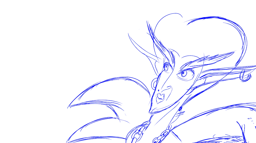
When I made the first thumbnail of The Glitter Wizard, I gave him long ears and elongated eyebrows. I realised I was sub-consciously giving him attributes associated with elves of the World of Warcraft MMORPG, so I thought I'd explore their designs a bit more.
I also started looking at other designs that may help me work out The Glitter Wizard's overall look, such as Jafar from Disney's Aladdin (1992), and General Lionwhyte from the Double Fine video game Brutal Legend (2009), despite their being villains.

Then I wanted to explore some origins. I was trying to work out what realm or domain that The Glitter Wizard would preside over, and I eventually fell onto music or art, so I looked into mythologies and deities of song, dance, poetry and the like, such as the Norse Bragi, the Greek/Roman Apollo and the Greek muses, and then I found out about the Finnish demi-god Vainamoinen who, as it turns out, was one of the major inspirations for Tolkein when he created the wizard Gandalf for The Lord of the Rings books.

Now I need to look at the glam rock and metal scene from the 1970s and 1980s that Twisted Sister played in contemporary. I want to look at the costumes worn by these bands, and find a way to combine the sparkly rock star aesthetic with that of a traditional wizard.

Bringing us back to colour schemes, The Glitter Wizard cannot be red, blue, green, or yellow (golden), because all those colours are taken. Pink or purple is the way to go. Again, although this assignment isn't taking colour on as a primary mode of focus as that aspect in its finality isn't being marked, it's always good to look at in the development stage. Also, if you remember us talking about it earlier, colour codes and shape language go hand-in-hand.
Anyway, I started exploring the colour theory behind pink and purple, and trying to work out what looks good together. Additionally, I kept thinking of flowers or butterflies when I was making thumbnails of The Glitter Wizard, so I included some dancing ladies flowers.

Including the objects are really, really helpful because I can think about adding some attributes also associated with them. For example, it's a good way to problem solve what way his cloak or robe should be, which I started looking at in this Shape Experiments board:

Here I'm playing around with the dark elf attributes of World of Warcraft as well then, as I was doodling out his hair and trying to work out the shape of it, I remembered Dracula in his "old man" form in Bram Stoker's Dracula (1992). I want to focus on heart shapes for him. One accessory I included from my initial thumbnail was a plectrum pendant on a chain, so that would be, to some extent, keeping with a general heart shaped or oval shaped motif.
I noted in the shape experimentation board how, if I'm to opt for some curved spikes, I prefer them facing down. Not only does this mellow out the evil aesthetic that the upward more horn-like option offers, it keeps with the heart theme. Additionally, if I double it up, it looks like flower petals!

Here, I'm going further with the shape language application and looking into more objects that have some sort of resemblance to heart or ovals/eggs. I've inserted the dancing ladies flowers, and then added some butterflies and moths. I'm starting to like the idea of using the wings of the moths and butterflies as the shape of The Glitter Wizard's ears too.
Of course, old man Dracula from Bram Stoker's Dracula is here too, sporting his heart shaped beehive.
[Check out the Acting for Animation book by Ed Hooks for help on the character background!!]

[Annotate this!!]
[Maybe make a separate collage board for characters that utilise hearts within their shape language, such as Verosika Mayday from Helluva Boss as example above]

[Fix annotations]


Trying to work out his poses for the character sheets, and turnaround sheets. I tried combining poses, then pushed the final pose a bit more to make it unique to him. Ensuring to check it every so often with the silhouette test to maintain the readability of his pose. The use of references also helps to be mindful of one of the 12 principles solid drawing.
[Insert and refer to Toniko Pantoja's videos on Solid Drawing, as well as The Illusion of Life book regarding the 12 principles]


I was reading through Ed Hooks' Acting for Animators (4th Ed, 2017), and I really liked the idea of gestures contradicting the words of the actor. Pretending that the Glitter Wizard is a part of the magical brothers council, I find it fun to think about him pretending that he isn't able to attend; there are plenty of other things he would much rather do. Taking the "Witch" sound clip ("Hell's Bells, I seem to have lost my broom again"), his face can be over-exaggerated, and he can glance over at his broom which is very much not lost, and he can give a cheeky wink to the camera after delivering the line.
Even without having the knowledge that his character creation is based on or inspired by the wizard from The Flight of Dragons (1982), his true intentions, despite his words, will be made clear through his body language; we can see that his broom clearly isn't lost, but he's saying it is, and it isn't the first time, so he's a bit of a rascal, isn't he?
Ed Hooks talk about how "gestures are actually a more primary form of expression than words are" and to consider them a "form of truth telling for the character", which is exactly what I want to play around with here with the Glitter Wizard; his verbal line delivery coupled with his body language while he delivers this line will continue to carry a story about him.
Wade Neistadt also delves into animating speech. He talks about breaking down the dialogue in YouTube video The Secret Workflow for Animating Dialogue. Neistadt, just as Hook discusses regarding a characters' true intentions, talks about how the lines are delivered which can alter the meaning behind them at around the [XYZ minute] mark. Granted, for the 5 Second Club assignment, I already have an audio clip provided to me to use rather than recording my own, but it is certainly still something to take into consideration.

[Clean this up]
Perfect opportunity to re-visit the Dee Snider studies and collage board for real life references. Dee Snider makes a lot of fantastic exaggerated faces when he's in his drag persona for Twisted Sister, which is exactly who The Glitter Wizard is based on.

Really rough turnarounds but, for the time being, they get the idea across. He is one sassy sorcerer with a shining sense of style!
The Execution
Storyboards

I'm using the same general storyboard template as I did for my Hedgehoge Animation Jam piece as I found it worked pretty well for what I was wanting to achieve. I quite like it, and I find it easy to read. [Find some quotes and reference material from the storyboard books you've got]

Just a really, really quick, really, really rough first draft of the first page of the storyboard for The Glitter Wizard! It is far too prose-y at the moment for storyboard standards, but I'm just shoveling sand into the sandbox right now, so I'll fix it up a bit after and take out the waffle then. I want to get a decent idea of exactly what he's doing. From there, I'll go off and take some real life reference video footage of myself based on the rough boards, then I'll refine them once I have a better idea of the more natural movements.

Again, just a really rough first draft for the second page of the storyboards for The Glitter Wizard just so I can have something to work with. I'll tweak it and finalise it a bit later, and make more storyboard-worthy!
Animatics

Above I thought I'd add in a background with the broom he's referring to in his monologue. I based the look of his castle loosely off Hyrule castle in The Legend of Zelda: A Link to the Past. Anyway, I also added in the sound clip just to get a general idea of how it all will look. Totally out of sync at the moment, I know, but we'll get to that soon.
He's still super out of sync, but he's getting there! Slowly but surely. It's not really a big deal because it isn't the focus of the exercise, but I think the doorway is really out of place. You'd half-expect a mummy to come out of there, but who knows what Deelirius: The Glitter Wizard gets up to in his castle, so who are we to judge?
...Anyway. I've been jumping back and forth between Toon Boom Harmony, and Adobe Premiere Pro because I keep having issues with the former where it seems to keep getting really overwhelmed for some reason, then terminating the session. It's working a lot better than it was earlier, so I'm happy enough (relative phrasing) with bouncing between software. I'm doing the main animation in Toon Boom, but then I take it to Premiere to add in the background (which was what was making it turn itself off), so then, as a result, I didn't even attempt putting in the sound clip; I just took that straight to Premiere. It, as you can imagine, makes trying to sync it up a bit more of a mare than it would have been if it would just co-operate. It's great when it works though, so I'll just deal with it. It does make the animation process a bit slower, but at least I'm getting somewhere with it and the program isn't turning itself off constantly this way. Whatever it takes and all that.
I really would have benefitted with making a mouth chart to help with the syncing, however; once I'm in the swing of things, I actually quite enjoy lip syncing. I recorded myself saying the line, so I'm going back and forth with that, but I'm also using a hand mirror to really see the mouth shapes.
The Animation
I ended up doodling up some quick mouth shapes because it'll honestly helps so much, and will make the whole animation process so much easier.


Much better! Now, I'll admit; I got a bit lazy with the mouth shapes, but I realised as I was going along the shapes I'd neglected to add in, so I just got out the mirror again and used that as a reference while I was animating. Here is the GIF version of it without the sound clip, and it almost syncs. He doesn't deliver the full line here just yet nor have I properly animated his mouth, but I want to make sure I have the timing right before I take it any further. That way, I have less to fix up; and I already have quite a lot I need to fix, so one tedious thing at a time.
It is honestly such a pain trying to sync this up properly between two different programs. I just tried to import sound into the project in Toon Boom and the software just terminated itself lol. Oh well. Anyway, what I really should have done was try to utilise a timing sheet, but I suppose hindsight is always 20/20, and a huge part of this learning process is for me is to figure these things out and to consider them for future projects. I think trial and error is one of the best ways to learn because you can, first hand, figure out exactly why you need to take the steps you need to take to reach your desired outcome more easily and efficiently.
Regardless of the software inconvenience I'm having with this, working on a lip syncing exercise makes it more and more apparent how true Richard Williams' words are on the topic. You don't say every single syllable; rather, there is a blend of mouth movements to create the words. This is something that I have been needing to tweak over and over again because it just wouldn't sync up properly, and it started working much better when I took it more into consideration.
It is so out of sync. I keep thinking I fixed him up, but another part always gets messed up, then something else gets messed up as I go between software, then again upon uploading it. AGH. I was getting fed up with it so gave him colour at the start, but it isn't detrimental to the assignment. I need more animation in his head to make sure I'm adhering to the other animation principles, like secondary action and ideally some follow through with his eyebrows, ears, etc. but trying to focus on his mouth movements (then his jaw moving along with it once I've worked those out), which is, to be quite honest, nearly impossible with Toon Boom not co-operating. Trying to go between software when syncing is the main point of focus is nearly impossible to do.
After this project, I'm definitely going to make sure I look more into using timing charts as they seem like an excellent fail safe if nothing else which will help tremendously when software won't play ball. It's the technical drawbacks that really hinder my process and, although I can just about make my way around a PC, I'm certainly not the most technical savvy person out there. It's just frustrating because I know what I need to do, and I know how to do it, but it's difficult to demonstrate. There's only so far you can take the saying "don't blame your tools", but hey.
Managed to get the sound to import into Toon Boom without it crashing, but I had to use an older version of it on a different computer... with a different drawing tablet. Either way, it is so much easier to work with now, except for the fact I have to redo quite a lot which makes it a touch more tedious to do. I've almost fixed the syncing - almost - but I'm in a much better position now than I was when I had to work with the voice clip independently to the animation.
"Hell's Bells--"
I'm trying to put in some secondary action where his eyebrows move up and down as he speaks. It adds a bit more life to the animation as a whole. I also need to fix his eye rolls, but I am loving the little wink sparkle at the end; I think it really adds to the sassiness of the character, as well as really highlighting the wink he gives us as it's giving the audience a clearer indication that he's lying about his broom. Although the brief stated that a background wasn't necessary, I felt it was beneficial to aid the staging of the overall piece. The Glitter Wizard technically interacts with the broom, as we can see him looking at it before and as he delivers the line, then essentially speaks to us, the audience, directly as he looks through the fourth wall - and polishes it off with his cheeky, sparkly wink.
The Final
Also on YouTube with a background: https://www.youtube.com/watch?v=l5R_PAH_q_A
I'd really like to properly finish this in my own time after the official assignment submission. I had a few technical difficulties plus being sick for a week that put me behind a bit, I think I would have at least nearly fully finished him. There are a couple of things, like his eyebrows moving up and down more often, that I wanted to try to incorporate to make sure I was demonstrating some overlapping action and secondary action to help lift the piece as a whole. I did focus quite a lot on the character design and developing him, including using inspiration from both the real world and existing animated characters that help add appeal to him, as well as making sure I was using real life references when necessary, such as with the mouth shapes to ensure better lip syncing.
His design is a little complicated for animation, so I suppose utilising the limited animation technique as discussed in The Illusion of Life to keep things more economical and balanced; I used a fixed camera in the end for showcasing the character and intended to keep the shot as a close up or mid-shot. This aids the staging as well, especially with where The Glitter Wizard is situated on the screen. For example, he's off to one side with room to lift his arm into the space in front of him, and a prop in the background that the audience can clearly see him looking towards.
To Do List:
Record reference footage of the dialogue [ X for my own cringe viewing ]
Used a mirror to create a mouth shape chart to aid animation process
Create storyboards [ X ]
Complete turnarounds [ X ]
Expression sheet [ / ]
References
Designing Characters with 7 Basic Shapes, Art Rocket. Available at: https://www.clipstudio.net/how-to-draw/archives/160863 [Accessed: 23/03/2022];
Color Wheel, via Color Adobe. Available at: https://color.adobe.com/create/color-wheel [Accessed: 22/11/2021];
Colours, via Kettlewell Colours. Available at: https://www.kettlewellcolours.co.uk/colours [Accessed: 22/11/2021];
Jak and Daxter: The Precursor Legacy (2001). Playstation 2 [Game]. Sony Computer Entertainment: USA;
How to Make a Character Design Sheet, Skill Share. 26th August 2021. Available at: https://www.skillshare.com/blog/how-to-make-a-character-design-sheet/ [Accessed: 02/12/2022];
How I approach challenging and difficult animation, Pantoja T. 26th July 2021. YouTube. Available at: https://www.youtube.com/watch?v=VI928RCgwIs [Accessed: 24/03/2022]
Tips and Techniques: Shape Language, The Walt Disney Family Museum. Available at: https://www.waltdisney.org/sites/default/files/2020-04/T%26T_ShapeLang_v9.pdf [Accessed: 23/03/2022];
Animating Gestures with Dialogue: What I Learned at DreamWorks, Sir Wade Neistadt via YouTube. 1st October 2019. Available at: https://www.youtube.com/watch?v=GDxaPJHWS1E [Accessed: 28/03/2022];
Available at: https://www.youtube.com/watch?v=-IRHVx5zBD0 [Accessed: 28/03/2022];
How to Use SHAPES to Create Character Designs - Shape Language Tutorial, Chelsea Gracei via YouTube. 14th February 2020. Available at: https://www.youtube.com/watch?v=GbG45s1EZvo [Accessed: 28/03/2022];
Shape Language, Sauer's Virtual Art Room via YouTube. 8th December 2020. Available at: https://www.youtube.com/watch?v=z6YI3F4pcMs [Accessed: 28/03/2022];
She goes into good detail about how the same shape can have its meanings altered depending on how it's portrayed. For example, the different ways a triangle can be conveyed to be either well balanced and stable, or completely unhinged and dangerous;
Triangles can represent: movement, deviation, sharpness, but can also "make a character feel severe, unstable, and dangerous"
You can implement this knowledge with The Glitter Wizard and how hearts are his main shape. Hearts are, in essence, rounded triangles, or a pair of pointy circles depending on what way they are being presented. Perhaps The Glitter Wizard has the potential to be a severe force to be reckoned with, but he's silly and eccentric which helps to round off the sharpness of his character. I'm leaning more towards the curved, floppy petal-collar for him, which is a focus on the rounded part of a heart, which implies he is a bit more laid back. However, his fingerless gloves are the pointed part of a heart; straight up triangles and, in combination with being on his hands, suggest he is indeed still a force to be reckoned with... plus, magic comes from a wizard's hands, so it becomes a bit of a double whammy here.
"Shapes can be altered & combined for more complex meanings - added complexity to shapes creates added complexity to the character";
Good Shapes - 10 Minutes to Better Painting - Episode 4, Marco Bucci via YouTube. 29th September 2017. Available at: https://www.youtube.com/watch?v=-ZknWKTpc90 [Accessed: 28/03/2022];
Discusses the readability of shapes, and how we view shapes in much the same way as we view words: we read them and they give us a lot of information in a more minimalist way.
He also goes into really specific details about shape language which is very interesting. From what I'm gathering in his explanations, there is a lot of overlap with acting for animation and gesture drawing. Cross-analyse this with Ed Hooks!!
"A scene of animation is more or less a series of gesture drawings [...] capture and draw the gesture" (he's quoting Stanchfield here, but still), and Bucci also touches on capturing the gesture of shapes. He says, "bring out [their] inherent identity a little better" with the use of C curves, S curves, and straight lines that build up that shape;
Character Design Mini-Series Pt. 1 - Gesture, Silhouette, Form, Marco Bucci via YouTube. 29th May 2019. Available at: https://www.youtube.com/watch?v=gI62rHNtg2w [Accessed: 28/03/2022];
He discusses and demonstrates the readability of a pose through the use of silhouettes, and how we can tweak them after blacking out the form in order to test out the readability. He also demonstrates through first hand reference photos on how the "same" pose doesn't necessarily communicate the story behind the character. Consider the animation principle of staging here; the poses must be theatrical and be able to communicate an idea clearly and concisely to the audience in a short timespan. That is to say, silhouetting in character designing is perfect for testing out the staging and to see how well the characters' poses communicate their personality, especially in combination with their shape language, as well as the colour theory that has been implemented within their design
Pro Tips: Reference, Character, and Acting in Animation, The Part-Time Professor via YouTube. 2nd April 2018. Available at: https://www.youtube.com/watch?v=BTLkDnsmnQU [Accessed: 04/04/2022];
The Secret Workflow for Animating Dialogue, Sir Wade Neistadt via YouTube. 8th June 2021. Available at: https://www.youtube.com/watch?v=5cIxEZwZmS4 [Accessed: 05/04/2022];
The Animator's Survival Kit - great section on lip syncing to refer back to;
Bishop, R. et al, 2020. Fundamentals of Character Design: How to Create Engaging Characters for Illustration, Animation & Visual Development, 3dtotal Publishing: United Kingdom;


Comments