
Visual Development (for Major Project)
- penspeare
- May 7, 2024
- 12 min read
(This blog post is part of a group for my Major Project assignment as part of my Masters in Animation. This is the general Major Project post, and the first one. Links to the other relevant blogs are under "Brother Blogs" under Navigation).
Preface
I renamed this blog "Visual Development", as the original intention was for developing my Pitch Bible for the production module of the previous semester, but the priority for it shifted to the creation of the Style Guide.
I wanted to go into better detail with the concept work aspect of the pitch bible, so it made more sense to dedicate this blog post to visual development and concept art and the role itself. I left in some of the pitch bible updates I did achieve, as I want to showcase the intent and progress as there was a lot of overlap with the style guide anyway, and a lot of it was inserted into the style guide too.
I moved some of the To Do lists and trying to work out the things I needed to do up here before we properly get stuck in:
Work by Tuesday 10th October 4pm:
Priority:
Aoife: Turnaround sheet [ X ]
(4-5 drawings) Front, back, 3/4/dynamic, profile/x2
The Devil: Turnaround sheet [ / ]
(4-5 drawings) Front, back, 3/4/dynamic, profile/x2
Expressions for both. About 4-7 [ X ]
Character Line Up sheet with everybody together is a must
Other things I need to do:
Style Guide: The layout emulates a grimoire; "annotated" with student notes
Draw out thumbnails on how you want it laid out
Look at existing grimoires for inspiration (already done some of this, so make sure to add it in as research evidence)
Have watched some videos on branding guides, so make sure to evidence this in your blog and discuss the transferable advice and how it's helpful
Pipeline: I'm very bad at this; have a diary on what I've been doing; need to update it though. Have a better idea/direction on what I'm doing and how long it takes, so able to do a better To Do list. But look at some Gantt charts
Industry Facing: Have blog started, but need to sit down and properly think about own branding and consider CV, etc.
Review of Industry Facing Materials midway through the semester!
Refer back to marking rubric and marking criteria to make sure you're ticking the boxes too
Navigation
Table of Contents
Preface (above)
Character Concept and Design Development
Establishing an art style
Conclusion
Brother Blogs
Take me to the Major Project Ideas blog
Take me to the Style Guide blog
Take me to the Industry Facing blog
Character Concept and Design Development
(Back to Navigation)
Very quickly, I'm going to refer to the Further Research, and Establishing an Art Style sections of the general Major Project Plans blog, as they played a huge part in this section of this blog. I'm linking it here as Wix makes it very, very tricky to cut/copy and paste within and across blogs when it includes a multitude of images between text.
I discuss roles such as art directing and visual development in the [Industry Facing] blog, but here I'll showcase the actual art development itself that's relevant to my project.
Here I'll be taking more time into developing the look of the characters, most notably Aoife and The Devil.
Aoife
I didn't have much time to fully develop Aoife for the Pitch Bible assignment , so I'd like to take that opportunity to do that here. I'm happy with Selena's design, so I'm not going to focus on her too much for this assignment, although I'll probably refine her a lot more in the future anyway.

I put together a quick mood board of The Rasmus guitarist, Emppu, who I wanted to base Aoife's look on. Although Aoife is quite slothy, Emppu has an energetic stage presence that radiates happiness and an intense love for what she does for a living (specifically playing music for her), which is something I'd like to demonstrate with Aoife; a happy but chill vibe.


I threw together a few more "rock chick" icons and to do some quick figure studies of, such as Joan Jett, because I also wanted to capture the energy of the poses - an aspect I'd like to translate over for Aoife's character.

Just a few more poses poses - as well as outfits - to study and observe (general rocker or grunge women), but also beginning to consider the shape language of said poses, as well as her general character look, but also some animal attributes to really make her unique and cartoonify her. It also adds a splash of fun to her development in a creative way.

I wanted to include an infographic I found as a refresher on basic shape language, and the combinations you can create, to reference back to.

Above, I'm actively focusing on the shape language, and figuring out how to apply the animal attributes to her character design while incorporating it with some of the figure studies for the poses - capturing the energy or the spirit of them, and using them to create Aoife, essentially.

[This isn't super relevant but, because I'm drawing a lot of inspiration from Scooby Doo franchises and the like and I'm looking at Shaggy in particular for Aoife, I enjoyed this rant by someone online: https://www.reddit.com/r/CharacterRant/comments/9ixu7a/shaggy_rogers/ [Accessed 22/08/2023]]
In the design board above, I'm working out Aoife's colour combination, and having a look at existing cartoon characters that share similarities in personality in some way. Additionally, they're from animated TV shows that have influenced this project in some form or another, particularly the Scooby Doo characters, Elsa (middle) and Shaggy (bottom).
I'm keeping the autumnal aesthetic, but incorporating that earthy green. I want to keep it on the bottom and use as more of an accent than anything - something I found as a common factor throughout those similar characters..
I don't want her to come off as military though; she's practical, yes, and knows what she wants, but she's still quite laid back. She's quite an active person if she isn't on her tenth nap of the day, but when she knows she needs something done, she will be right on it.


Just need to neaten up the lines.


I just need to neaten them up, add fingers and round her hat in the first illustration, fix the chain, and do something about her tank as it's bothering me. Work out the mechanics of her hat and hair and what I'm doing with it if I want to go with the gyroscopic angle route; same with her bullet belt so it's easier to animate but still gets the idea across.

Up here, I started experimenting with expressions. They are pretty rough at first, but you need to shovel sand into the sandbox before you can build sand castles.

This is how they turned out eventually. This is just the linework for them. I hadn't fully decided whether her tank top has a DIY torn off collar, or goes up to her neck - the important part is, it's practical for her and keeps her cool if she gets too warm.
I'm just going to add Aoife's room development here because it's not really a major focus for this project as of yet, and is more for the actual pitch bible itself, and is showcasing her as a character.

I applied the location scouting research photos from Ikea to the old pitch bible image of Aoife passed out on the sofa bed/futon; it makes it look more authentic, and also looked up some photos of people in the pose, or at least very similar, to how I wanted Aoife presented and combined them.

This one was originally for a page in the pitch bible when I still had the intention of developing it before the priority shifted away from it. I threw it into the Style Guide instead, and left it here as well to show the progress of it, as it's a fun piece that demonstrates some of her character, as well as a full body pose with how the character interacts with objects.
The Devil
Even Aoife got more development than The Devil character, so I want to develop him a little more here beyond simply looking at basic Baphomets and calling it a day, and go into exactly how I want his personality to be conveyed through his visuals. Let's look at some


I had an old book on faeries and folklore in the house, so I had a look at how they depicted satyrs and devil-like characters for some comparison on how similar humanoid characters are drawn.
The above examples are very eerie and foreboding, but I want our Dave to be a little goofy; it makes the character a little less threatening.


To go along with Aoife's autumnal colour scheme, I picked summer for Dave as a basis for his. From there, I could experiment with Adobe's colour wheel and work out complementary colours. His character design is also quite floral by intention, as it also has an interesting contrast to the expectation of a devil character having more aggressive colours, such as harsh dark reds, or blacks, and more shadowy colours to imply evilness. Whereas Dave's colour scheme is much softer, warmer, and welcoming with pastel shades.
I like this direction especially as it helps the characters themselves complement each other visually. I also have it in my head that the characters butt heads a bit at the start, but gradually grow a lot fonder of each other. You would like to think so considering he's bound to Aoife's spare room.

I'm experimenting a lot and going through some trial and error with Dave's look, so I made sure to annotate everything as best as I could; my thought process and what I did and did not like, or throwing in some existing animated characters that are either similar to him or have styles or approaches that I like and may want to attribute to Dave here.


After looking at faun characters, I've realised his knees should actually be going backwards, so I'm going to have to move them further up his legs here on the turnarounds

Again, I'm going to need to fix the legs here; this will b a tricky one because his legs are crossed in this sketch, and it's trying to translate from the reference images, which is tricky enough at times as often I find my references end up being female, so the proportions aren't as broad as I'd like them to be in the drawing. That said, it's a matter of correcting it and being mindful of how I'm altering it.


[Remember to CENSOR NAMES and any unprofessional language]
Sarah, my mentor, suggested to include the discussions regarding development of the concept work as it counts as "market research". My Discord server is specifically for encouraging people to work on their creative projects and as a support network, so it's the right sort of place for discussions of that nature.

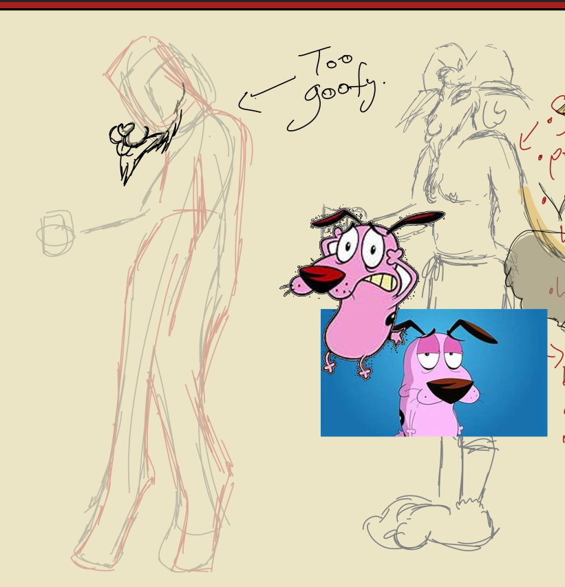
I am so glad that Dave is mostly a couch potato after all this.


Available: https://dogsinfoblog.com/drawing-courage-the-cowardly-dog/ [Accessed: 05/12/2023];
The Virtuoso Demon
Note: Unfortunately, the poor Virtuoso Demon got ghosted as priorities had shifted towards developing Aoife and The Devil, but I'll leave this section in anyway to show what I had originally intended.
I want to focus on The Virtuoso Demon as well as I think he's an important asset to be included in the style guide later because of how the character design is. That is to say, he's a phantom style character, so it will need to be outlined on how to draw and animate him, what effects he would need. So, it's a good idea to develop him a bit more here.
Available at: https://www.youtube.com/watch?v=MQ-4EuLe4nc [Accessed: 28/09/2023]
SUPER helpful and informative on character design, the reasoning behind decisions, and even staging and the general aesthetic of a show
Background Concept Work
I want to emulate my own traditional art style when it comes to the background art. I use a lot of traditional mixed media, with a focus on dark chalk pastels, charcoal, and some acrylics to give it a more DIY and painterly aesthetic. The characters are much cleaner and marker based - the digital translation isn't difficult to achieve here, although I'd like the shadows to emulate smudged charcoal - and that helps them pop out from the background, instead of blending in too much where it's really difficult to see them.
Truthfully, the background concept work took a backburner as I ran into some major life issues/events halfway through the module where I think is when I started looking into these. Even though I didn't go through with them, I'll show the progress of what I did undergo, so we can see the intention or how I started the research process and thought process behind it.
The Devil's Domain
Being Aoife's spare room in her house, or rather the renovated loft area.
From the first draft of the pitch bible:

I went "location scouting" in Ikea with my friend to gain some inspiration for interiors, as they're all already set up:

I scribbled some annotations that went over what I did and didn't like about the "scenes".
I took some for Aoife's room, or at least for the shot of her passed out on her sofa bed:

I had every intention of doing the following two bullet points, but they were negated for other tasks but also around the time of a family bereavement, so they were ultimately abandoned. I've left them in anyway to demonstrate my thought process for the visual development side of the project anyway:
Insert some studies of the examples above in the medium and style you'd like to achieve [ ~ ]
Make a quick model set using the research photos and the ideation of the original draft from the pitch bible [ ~ ]
General Layout and Sprucing Up of Pitch Bible
Again, this is when I had every intention of further developing the pitch bible, but priorities shifted. I'm leaving it in to show the thought process anyway, and a lot of it directly influenced the Style Guide anyway, as well as being important for this blog.


Made the font smaller, broke the text up with more paragraphs, and added some more information, and generally spread it out a bit more. I need to add the annotations and graffiti

Playing around with this page so I can fit as much information in as possible.

[Discuss the layout]

Working on the front cover of the pitch bible with Aoife's updated character design. Definitely need to take a photographic reference to get the exact pose right, or close enough to it, so I'll take one later with the props or similar, as close as I can get.
Had an idea though! I like that the layout is a little "swirly" and weird, so I want to incorporate the logo for the series in the middle. I'm laying it out so that objects and props are flying out of Aoife's backpack, including salt (basic things like table salt, like what Allison used in Disney's Hocus Pocus (1993)), and a homemade ouija board, so the title could be the planchette for that.


I actually like the sketchiness of this as it adds to that DIY aspect. It also reminds me of some other "jerky" looking fonts from some movie and series titles that have a major horror theme or pastiche element to them.

Take reference photo for Aoife's pose for the front cover [ ~ ]
Take photos of binders and project folders [ X ]
Tea stain some file paper; take photos of results [ ~ ]
Include screenshots of Discord server discussions; counts as market research and peer reviews [ X ]
Draw up some poses for Dave the Devil as Sarah suggested [ X ]
Look at some grimoire references [ X ]
Look at the faeries book you have for help with Dave the Devil [ X ]
Conclusion
(Back to Navigation)
The final outcome for this project is a PDF document of the style guide, and is linked in the submissions page of Blackboard, alongside links to the relative blog posts, including this one.
Problem solving included looking up references, or taking my own first-hand photographs, to make sure poses were correct and looked fine, and building upon them so they fit the with the project. Although I would have preferred to have obtained more first hand images for research, I did what I could considering circumstances. Some references I had to use as a base for characters that were not human, such as Dave The Devil, who is a Baphomet figure; I ran into a lot of issues with him regarding his legs in particular, as it was combining human anatomy with goats. I had discussions with peers and looked at existing animated characters to compare and contrast.
Also applying the theories of shape language and colour theory; exploring these so, again, they fit with the project and also, when it comes to different characters, they complement each other within the same world. All important aspects to consider for visual development and as a concept artist.
References
(Back to Navigation)
Your career in animation: How to survive and thrive, 2nd Ed. Levy, D. B. Allworth Press: New York, USA;
Lucy discovers Mr Tumnus via YouTube. Available at: https://www.youtube.com/watch?v=5iXXdGfPPR0 [Accessed: 21/11/2023];
Creatures of Narnia: Mr Tumnus | Narnia behind the Scenes, via YouTube. Available at: https://www.youtube.com/watch?v=z_ZXunrWXHA [Accessed: 21/11/2023]
Faun Scenes in Pan's Labyrinth, via YouTube. Available at: https://www.youtube.com/watch?v=wcN1qFuuI-A [Accessed: 21/11/2023];
Available at: https://www.youtube.com/watch?v=oNciYSu9fDQ [Accessed: 14/12/2023];
What is a turnaround in character design and how to draw one, via Domestika. Available at: https://www.domestika.org/en/blog/5703-what-is-a-turnaround-in-character-design-and-how-to-draw-one [Accessed: 03/10/2023];
Animate ANY character turnaround/rotation in 2D (and improve your drawing skills, Manu Mercurial. 9th June, via YouTube. Available at: https://www.youtube.com/watch?v=nvCSkDcyh5Y [Accessed: 03/10/2023];
Available at: https://color.adobe.com/create/color-wheel [Accessed: 28/09/2023]; Available at: https://www.kettlewellcolours.co.uk/blog/jo/summer-explaining-the-different-types [Accessed: 29/09/2023];


Comments