
Hard Work Builds Character (Design)
- penspeare
- Jan 13, 2022
- 14 min read
Updated: Jan 25, 2022
This blog post regarding my project for the Animation JAM will focus on design, with particular concentration on character design. Lots of mood boards and playing around with colour schemes ahead!
(Take me to the Storyboards and Planning blog post!)
I decided to adapt an old comic strip I made into a short animation. They are gag comics that generally contain little to no dialogue, and have a basic format of four panels.
I was juggling mainly between the key breaking one (top row, furthest one to the left), but leaning more towards the headache one (top row, furthest to the right) as it was the first one I made and therefore much less developed and makes great use of the exaggeration principle. There is also little animation in it which, yes, it sounds a bit wild, but I need to appreciate my limits. I want to focus on the character design aspect (this blog), and developing storyboards (the other post), but I'll be playing around with lots of anticipation and the changes of facial expression, which brings a lot of secondary action into the mix too.
I've already referenced it a little bit, but below is a mood board of some of my favourite personal comic strips, whether they're for the gags themselves or the overall aesthetic of them:
I'm not sure how relevant this will be, but there was an example of a ukiyo-e print piece featured in the Colour Theory lecture that Sarah put up during the section on Complementary Colour Schemes. It reminded me that I have a big book on loads of ukiyo-e artworks, something that I really like and I'm surprised I forgot to mention it previously because I'd love to incorporate a similar style, especially for backgrounds.

Going for the Headache Comic to adapt into a short animation
For the design, I'll probably take the "Sister" comic. The big poofy hair is fun, and it'll look funnier when the monitor light blasts her face off
Not sure what I'll do about the Headache Gremlins at this stage; they'll be a pain, so I might omit them entirely, and maybe just have a self-tightening vice on her head
New Character Design and Mood Boards
The final panel in my comic reminded me of the specific and notoriously graphic scene from Barefoot Gen (1983) where the nuke literally melts the inhabitants of Hiroshima
I think I remembered them wrong but, talking about the vice on her head, it reminded me of the Asylum Children from the 2000 PC game American McGee's Alice
Such gruesome references so far
(Just a quick FYI, I've copied and pasted these links into the Reference List as well. I nearly just cut and paste but I thought it was easier to show the thought process as it went along to leave them here as well):
Barefoot Gen Atomic Bomb Scene, 20th November 2019. Posted by Noy Smile via YouTube. Available from: https://www.youtube.com/watch?v=uaWtqeQrj8w [Accessed: 15/11/2021]
Barefoot Gen 1983 (Full Movie) English Sub, 26th July 2020. Posted by The SayAnime via YouTube. Available from: https://www.youtube.com/watch?v=fpAgmvjJCtI [Accessed: 15/11/2021]
American McGee's Alice - 06 -Skool Daze, 16th July 2021. Posted by Gökay Gökçe, via YouTube. Available at: https://www.youtube.com/watch?v=RuTUsUg5xiY [Accessed: 15/11/2021]
Also, yes; I absolutely did remember it wrong, but I'll pop it into the mood board anyway, if not to demonstrate my thought process in terms of design development and inspiration
Old School Gothic: A Gallery of '80s Goth and Deathrock Culture, via Post Punk.com. 2nd July 2016. Available at: https://post-punk.com/oldschool-gothic-a-gallery-of-80s-goth-and-deathrock-culture/ [Accessed: 15/11/2021]
Review: The Art of Brutal Legend, Teoh Yi Chie. Via Parka Blogs. 2nd July 2013. Available at: https://www.parkablogs.com/content/review-art-of-brutal-legend [Accessed: 15/11/2021]
Hellraiser (30th Anniversary Edition - Official Animated Video), 29th October 2021. Ozzy Osbourne via YouTube. Available at: https://www.youtube.com/watch?v=zw79RVnlCb0&list=PLo8KMaBAOY4MCP2zqlxg5eqxoTDUxkBhy&index=88 [Accessed: 15/11/2021]
Including this because I love the semi-realistic art style, the general wild shenanigans going on, and the somewhat minimalist animation
Background Design
What is Expressionism in Film?, Clip Champ. Available at: https://clipchamp.com/en/definition/what-is-expressionism-film/ [Accessed: 15/11/2021]
"German expressionism chooses to highlight the character’s inner world, emotions, and turmoil over realism. This gives a lot of room for horror to bring the psychological state of the characters to come to light."
In Focus: A Brief History of German Expressionism, Discover Goldmark. March 2017. Available at: https://discover.goldmarkart.com/brief-history-german-expressionism/ [Accessed: 15/11/2021]

I forgot about the Hammer Gremlin. If I have the time and the energy, I might add him in later but, for now, he's being omitted for easiness;
Also forgot her freckles are still on the skull!
I know the colouring in the strip is minimalistic anyway, but the lack of colour in the final panel was deliberate to add to the effect of the blast, so I want to keep that in
Was doodling out thumbnails, and the button pressing panel is clearly an exaggeration of how far fingers bend. Made me think of Dee Dee from Dexter's Laboratory, a very obvious example of this being used a lot


Above is a mood board of the general aesthetic I'd like to go for. It includes big-haired musical icons of the post-punk and glam metal era, so I'm going to do some studies of them to help me work out the final character design. I've also included some character concepts from the 2009 video game Brutal Legend, a love letter to the heavy metal music, the look based on the genre's album art. Here there is a focus on the "glam metal" faction, as well as some "doom metal" for the face melting scene alongside screenshots of the infamous nuke scene from Barefoot Glen.

Really, really like the - sometimes subtly - warped props and backgrounds of old point-an-click games, like from Day of the Tentacle and Sam & Max: Hit the Road, and with the added bold colours against otherwise dark or even eerie backgrounds
Reminded me of the German Expressionist movement, which reminded me of the silent film The Cabinet of Dr Caligiri, which was a huge inspiration for Tim Burton, which led me to start looking at Corpse Bride as well. Additionally, I added in some iconic Expressionist artists, such as Franz Marc and Erich Heckel, who both employ dark yet incredibly bold methods in their work, often with some degree of warping.
I like the warping in a lot of the images, especially because they often really help to frame the subjects. This is evident in a lot of scenes of Day of the Tentacle, such as in Ned Edison's room with the hamster tunnel being used to add a sense of weirdness, and helping it to frame the rest of the scene. Additionally, it's a bright orange which further helps it stand out

I threw in some piece by Andi Hagen in this mood board because we have somewhat similar styles, and I really enjoy seeing their work. Their comic strips are usually comedic with gothic characters, which adds another strange layer of comedy to them in my opinion. It's also semi-realistic, with small but impactful cartoony elements.
Add in some Foamy the Squirrel screencaps - comedic short cartoons during the early Internet era that, more often than not, centred around the fictional lives of starving artist alternative characters which, as an adult, I appreciate a lot more and, with some episodes, find infuriatingly relatable. Also for the nod to early 2000s, typically one long static shot, short gag Internet cartoons, which Foamy was one of many.


With all the backcombed hair, I started thinking about hedgehogs, and how they're very cute but also very, very spiky... a bit like some '80s punks or goths/post-punk aesthetics with their candy floss esque hair. I'm thinking of adding some hedgehog attributes to the character designs, so they have friendly rounded features at their core, but are a little rough around the edges, so they have "approach with caution" sort of vibes


Character designs, as we've discussed several times, go hand-in-hand with animation principle of staging, and how poses should be dynamic, take on the principle of exaggeration by being larger than life, theatrical, and obvious. I've always loved how a lot of character concepts, particularly in the example above from the book Steven Universe: Art & Origins, almost look like fashion designs. Granted, I would often use references from models and magazines to gain inspiration for their aesthetic, but to also reference the poses. They are, more often than not, dynamic on their own merit, but you can also push them further, and further exaggerate them more and more!
I also love how Lion started off incredibly elaborately designed; almost ornamental. The change, especially compared to the likes of Opal, as evidenced in the Fusion Concepts page, was so, so drastic. That's not a bad thing at all! Additionally, I really enjoy the obvious play around with the shape language of Lion, and how they've incorporated the star motif. They kept it in the end, evidently, but made it much more subtle. I really love Lion's design progress. It's so interesting to me. Speaking of shape language, I had a quick experiment with it myself when taking into consideration my character's hair. See below:

I have Barefoot Gen, a 1982 anime film in the perspective of a child dealing with the horrors of nuclear war, as a reference or inspiration point for the animation of the face melting. Also the results of the power buff "face melter" from the 2009 video game Brutal Legend
Gonna need to look up some skulls. Not just on Google; this calls for a museum trip to take lots of photos
Think about what you'll do in terms of backgrounds. I have Day of the Tentacle and Sam & Max: Hit the Road as heavy inspirations, which eventually led into German Expressionism, which I want to heavily look into
For the most part, it will be a computer desk with a monitor. I want the monitor to sort of warp around and frame the character, in a similar fashion to the backgrounds in old point-and-click video games from Lucas Arts and Double Fine, as well as paintings from Germain Expressionism;
(In the end, I didn't really have a lot of time to really go out there with the background design as I focused pretty much entirely on the character design, so the end result is actually quite basic. However, I did still try to incorporate the warped, roundedness of objects that are often foundin German Expressionism to help with the overall staging and framing of the composition, so I made sure I kept that aspect at the very least. Also, I did consider the aesthetic of the paintings and set dressings of German Expressionist pieces within my mood boards, and they still played a huge influence into the project regardless. For a 10-15 second animation, there still sure is an awful lot of work that goes into it!)


Colour Me Intrigued
A really important aspect of character design is the colour scheme. Let's talk about some colour theory, and my exploration of the colour scheme for the character.

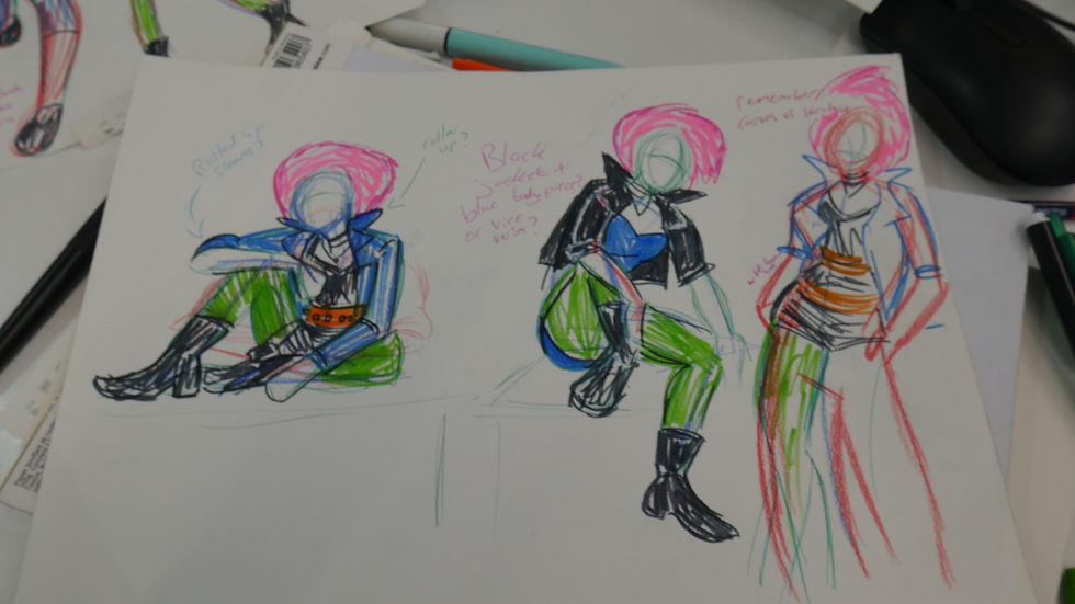
Before I worked out her outfit, I put together a colour mood board
I watched the video lecture put together by my lecturer, Sarah, on Colour Theory, and considered some of the types of colour wheels discussed in it, and implemented them in the mood board.
I actually combined triadic as well as complementary and had a look at how they'd look by playing around with them in Photoshop (as demonstrated above in the mood board): Complementary Colour Schemes "A complementary colour scheme is made up of polarising colour. I.e. colours that are opposite each other on the colour wheel";
"Best used for dramatic, strong, or bold statements and can be used to display tension as well as harmony" - a "bold statement" is certainly something that punks enjoy doing, so why should Hedgehoge be any different? Bright green and bright pink, as explored in my colour scheme mood board, perfect punk colours too;
"Usually more arthouse and indie films utilise these palettes"; "highlights contrast and duality between characers and their personalities" Triadic Colour Schemes
"Triadic schemes are made up of hues equally spaced around the colour wheel at 120 degrees apart" "a triadic colour scheme can create more balance compared to duality, and therefore to the scene. It sets the tone: fun and carefree; also whimsical, and draws attention to objects and character traits"
"Can create a very balanced, and often very, very bold scheme" - again with the boldness; this is something I would love to convey with Hedgehoge. I quite like the idea of having some form of balance in there as well; it's an interesting juxtaposition for an eccentric punk aesthetic, however; it also plays in with her general calmness in the animation, albeit due to an ailment i.e. a headache;
I tend to like to base colour schemes on either seasons or the time of day, so I have somewhere to start from. For Hedgehoge, I played around with the season of spring, and tried looking at the horizon during the time of the twilight period. I thought spring was maybe too "happy" for the character, so I thought, "what about a rainy spring day?"; I quite like the juxtaposition of bright, bold colours with miserable undertones. I've often discussed before how I really enjoy media with similar juxtapositions like this, such as horrors or neo-noirs that contain some level of brightness to them to help them pop out a bit more, so I wanted to convey that here with my "grumpy punk" character;
Back again to the lecture on colour theory. I'd like to talk about the colours I have chosen, specifically for Hedgehoge and why, in slightly more detail, backed up with the theory of colour:
Pink: "Visually striking/stimulating"; "rarely used in a serious way"; "fascinates/draws attention"; "femininity"
Blue: "Shows neutrality"; "creates calmness"; "passivity"; "isolation"
Orange: "Communicates fun"; "expresses freedom"; "fascinates";
Green: "A lot of villainous characters adopt this colour"; "re-vitalise"; "the more natural, the more harmonious. The more neon the hue, the more 'toxic' the connotations"


"However, while comics colors were less than expressionistic, they were fixed with a new iconic power. Because costume colors remained exactly the same, panel after panel, they came to symbolize characters in the mind of the reader." - Scott McCloud, Understanding Comics: The Invisible Art, Chapter Eight: A Word About Color, Page 188.
I'll be honest, I made this "colour block character" after my character design was finished. I was reading through Scott McCloud's 1994 book Understanding Comics and he mentioned iconic colour schemes, then I wanted to see how Hedgehoge looked as a colour block character. It's certainly not the neatest as I mostly just threw it together, but it was fun and interesting to see. I think, if anything, it's a good way to test if your character design stands out, as well as the "silhouette test" that is more often than not used to help create characters and dynamic poses.

Won't be seeing her below the waist as she'll be seated throughout the entire JAM animation, but it was still fun to play around with, and is always worth thinking about. So much thought can go into characters when writing scripts as well that the audience may not necessarily see on screen, but it has helped shape the character behind the scene and, ultimately, is a small puzzle piece for the final product;
Now to figure out what her face will look like as that is the main focus and is there a great deal more important than her legs, which you don't see

"Gyroscopic" hair, like Loona, from Helluva Boss's, hair or Mikey Mouse's ears, which means it will stay the same shape no matter the orientation of the character. It makes for more straightforward animation
That said, it won't make a great deal of difference in the JAM project because Hedgehoge will be pretty much in the exact same general position throughout but even still

I inserted some characters that I took both conscious as well as subconscious inspiration from while drawing out my character, or those I was reminded of when I looked at her from a glance. The top three characters, when animated, have an animation technique called "gyroscopic" implemented for their hair or ears to make animation easier. If Hedgehoge were, for example, to be a character in a series, I would use this for her hair. I figured this out during the expressions drawing stage while I was trying to draw her face, particularly from different angles. At first, it was accidental, but then I thought it would probably be best to actually implement it as a stylistic choice, so that's why I've included other examples that use it. Mickey Mouse is a particularly iconic example of it, with Spinel's character design from Steven Universe taking that inspiration very directly, where she is actually based on rubber hose animation:
Above is an example of rubber hose animation. Specifically the very first Mickey Mouse cartoon, Steamboat Willie, originally released in November 1928. From the beginning, Mickey Mouse (or Steamboat Willie, I suppose) conveys gyroscopic ears as a stylistic choice, but also presumably to make animation easier


Twilight, via Earth Sky. Available at: https://earthsky.org/earth/twilight-2/ [Accessed: 22/11/2021]
Color Combinations Cheat Sheet, via Oberlo. Available at: https://www.oberlo.co.uk/blog/color-combinations-cheat-sheet [Accessed: 22/11/2021]
Colours, via Kettlewell Colours. Available at: https://www.kettlewellcolours.co.uk/colours [Accessed: 22/11/2021]
Color Wheel, via Color Adobe. Available at: https://color.adobe.com/create/color-wheel [Accessed: 22/11/2021]
Add some references for gyroscopic aspects, such as Mickey Mouse, Spinel from Steven Universe: The Movie, and Loona from Helluva Boss

Facial Expressions
Typically treated as Secondary Actions, as the body language and positioning should be what drives motives and actions. They must be obvious, but not detract from the main action. You'll see later on or in the sister blog post to this one on Storyboarding and Planning, but I played around a lot with Hedgehoge's facial expressions, and tried to also incorporate as much squash and stretch as I could. It's a little tricky as the style I have is semi-realistic, so where it is good to exaggerate as much as possible, it can lead into unnecessarily funny territory. That said, my project is a scene full of gruesome gags, so it's probably fine.
It's good to have the facial expression change after or before the main action. This is evident in a lot of old films, as I noted while watching Universal's original Dracula, as I noticed how slow paced a lot of the acting actually was, such as line delivery and, indeed, their facial expressions. It's all very theatrical; obvious considering most of the actors of the time were seasoned stage play actors, so every single action had to have been grandiose and obvious so that the live audience would not miss a beat. On that note, facial expressions then, subsequently, play a huge role in the anticipation of new actions as well as the reactions too.


I'm trying to figure out the best way to precisely lay everything out. Regarding the 12 principles of animation, this will affect the staging immensely. I definitely want to bend and warp the monitor akin to German Expressionist art styles so I've been playing around with that quite a lot in Toon Boom, but I need to be careful with it because there still needs to be room for the character, as well as the direction of the action, as she will then enter the other third of the frame as she is reacting to the light coming on and literally blasting her face off. There is some negative space above her that I'm nervous about though because it looks bare, and nothing happens in it
I took some photographs of a set-up I made to get a better idea of what I was after, and then added annotations:


To help alleviate the silhouette and the line of action, utilising the animation principle of exaggeration is an excellent idea as well. Making everything as theatrical as possible is perfect for convey clear and obvious ideas onscreen, which is the ideal for animation.
The body language and posture of Hedgehoge here in her character concept already tells a lot about her character from the silhouette alone. Also ensuring that the animation principle of arcs is being effectively used; it really helps to push and exaggerate the line of action and therefore the pose of the character, really allowing the pose itself to tell its own story.
Once the silhouette is removed and you can see both the colour scheme and the facial expressions of the character, it further adds to the overall gesture and reinforces what the design itself is trying to say.
(Take me to the Storyboards and Planning blog post!)
Reference List
About Colour Palettes, via Toon Boom online. Available at: https://learn.toonboom.com/modules/introduction-to-animation2/topic/about-colour-palettes3 [Accessed: 06/12/2021];
Content Organization, via Toon Boom online. Available at: https://learn.toonboom.com/modules/basic-concepts2/topic/content-organization [Accessed: 06/12/2021];
Available at: https://www.clipstudio.net/how-to-draw/archives/164740 [Accessed: 02/12/2021];
Available at: https://www.skillshare.com/blog/how-to-make-a-character-design-sheet/ [Accessed: 02/12/2021];
Available at: https://yourartpath.com/100-character-design-sheets [Accessed: 02/12/2021];
Twilight, via Earth Sky. Available at: https://earthsky.org/earth/twilight-2/ [Accessed: 22/11/2021];
Color Combinations Cheat Sheet, via Oberlo. Available at: https://www.oberlo.co.uk/blog/color-combinations-cheat-sheet [Accessed: 22/11/2021];
Colours, via Kettlewell Colours. Available at: https://www.kettlewellcolours.co.uk/colours [Accessed: 22/11/2021]
Color Wheel, via Color Adobe. Available at: https://color.adobe.com/create/color-wheel [Accessed: 22/11/2021];
Add some references for gyroscopic aspects, such as Mickey Mouse, Spinel from Steven Universe: The Movie, and Loona from Helluva Boss;
What is Expressionism in Film?, Clip Champ. Available at: https://clipchamp.com/en/definition/what-is-expressionism-film/ [Accessed: 15/11/2021];
In Focus: A Brief History of German Expressionism, Discover Goldmark. March 2017. Available at: https://discover.goldmarkart.com/brief-history-german-expressionism/ [Accessed: 15/11/2021];
Barefoot Gen Atomic Bomb Scene, 20th November 2019. Posted by Noy Smile via YouTube. Available from: https://www.youtube.com/watch?v=uaWtqeQrj8w [Accessed: 15/11/2021];
Barefoot Gen 1983 (Full Movie) English Sub, 26th July 2020. Posted by The SayAnime via YouTube. Available from: https://www.youtube.com/watch?v=fpAgmvjJCtI [Accessed: 15/11/2021];
American McGee's Alice - 06 -Skool Daze, 16th July 2021. Posted by Gökay Gökçe, via YouTube. Available at: https://www.youtube.com/watch?v=RuTUsUg5xiY [Accessed: 15/11/2021];
Old School Gothic: A Gallery of '80s Goth and Deathrock Culture, via Post Punk.com. 2nd July 2016. Available at: https://post-punk.com/oldschool-gothic-a-gallery-of-80s-goth-and-deathrock-culture/ [Accessed: 15/11/2021];
Review: The Art of Brutal Legend, Teoh Yi Chie. Via Parka Blogs. 2nd July 2013. Available at: https://www.parkablogs.com/content/review-art-of-brutal-legend [Accessed: 15/11/2021];
Hellraiser (30th Anniversary Edition - Official Animated Video), 29th October 2021. Ozzy Osbourne via YouTube. Available at: https://www.youtube.com/watch?v=zw79RVnlCb0&list=PLo8KMaBAOY4MCP2zqlxg5eqxoTDUxkBhy&index=88 [Accessed: 15/11/2021];
Thomas, F. and Johnston, O. (1997) The Illusion of Life: Disney Animation. USA: Hyperion;
Williams, R. (2001) The Animator's Survival Kit: A Manual of Methods, Principles and Formulas for Classical, Computer, Games, Stop Motion and Internet Animators. USA: Faber and Faber;
Whitaker, H. Halas, J. Sito, T. (1981) Timing for Animation. 2nd edn. Oxford: Focal Press;
Principles of Animation: Staging, by user "D'source Ekalpa India", 18th March 2016. Available at: https://www.youtube.com/watch?v=gTaZjHZq_2o [Accessed: 14/10/2021];
McDonnell, C. (2017) Steven Universe Art and Origins. United States: Abrams


Comments